
Choosing vitrified tiles should not begin with a colour swatch. For architects and interior designers, the better starting point is the space itself: how it will be used, how light will move through it, what visual scale the design requires, and what the surface needs to do over time.
Vitrified tiles are engineered ceramic surfaces produced through a high-temperature manufacturing process that creates a dense tile body. In practical interior specification, however, the category is much broader than a technical definition. Designers encounter vitrified surfaces through different visual languages, including stone and marble interpretations, solid colours, wood-inspired graphics, high-gloss surfaces and texture-led finishes.
That makes the key question less about whether a tile is simply “vitrified” and more about which surface, size and finish suit the architectural intention and application.
Start with application, not appearance
A surface that looks compelling on a sample board may behave very differently once it covers an entire wall or floor. Before selecting a design, define whether the tile is intended for a living area, kitchen, bathroom, reception, hospitality environment, retail space, circulation zone, feature wall or another application.
This immediately narrows the specification. A reflective surface may be deliberately used to amplify light in one interior, while another project may need a quieter matt or textured expression.

Tile size changes the architecture of the surface
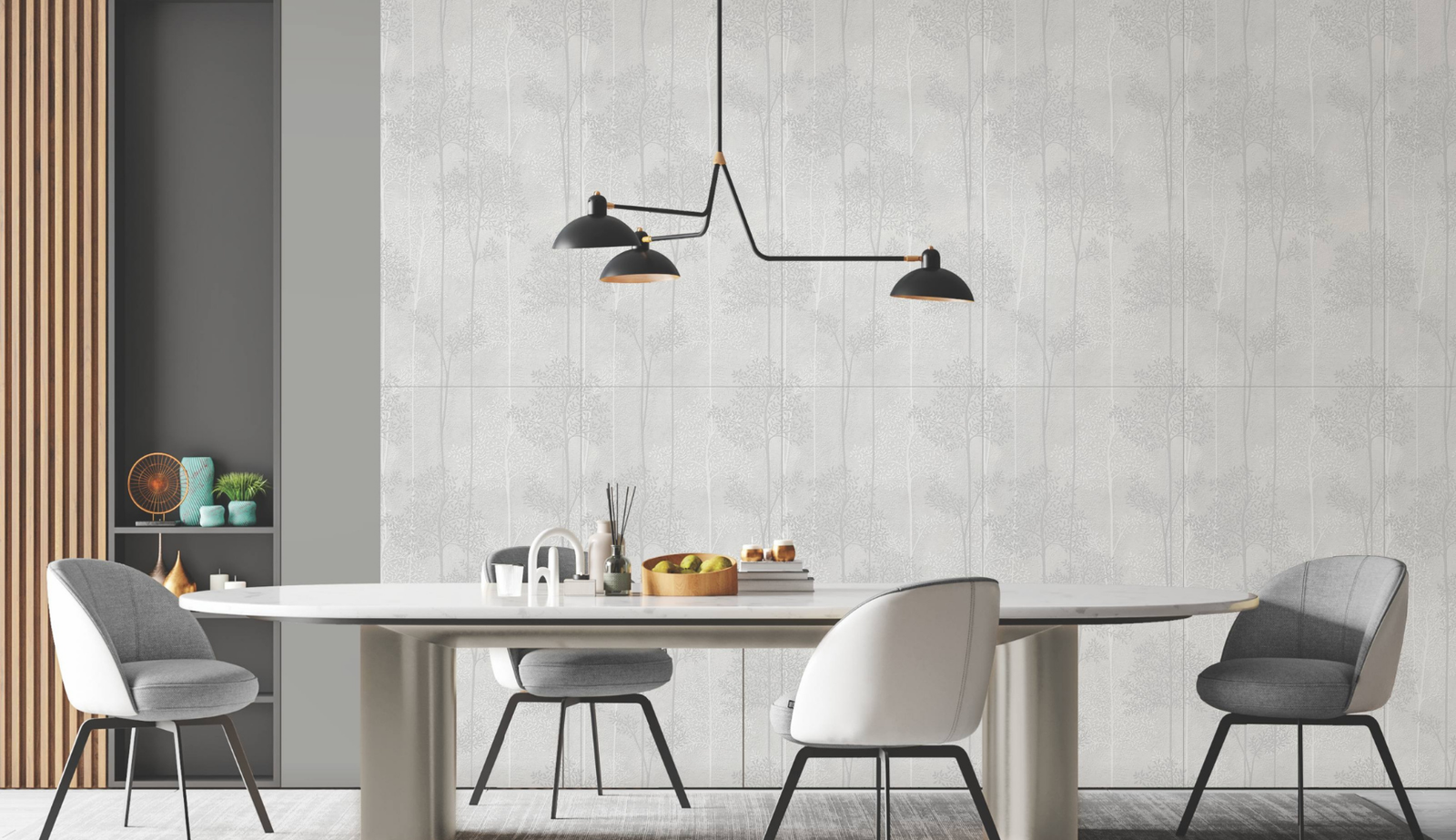
Large-format modules such as 600×1200 mm can create a more continuous visual field than smaller modules. The proportion works particularly well when designers want fewer visual interruptions and a stronger sense of material continuity across walls or floors.
Orientation matters too. A 600×1200 module used horizontally can visually stretch a wall, while a vertical layout can emphasise height. The final result depends on room proportions, joint alignment, openings, furniture and the direction of the surface graphic.
Understanding vitrified tile finishes
| Finish direction | Visual character | What designers should consider |
|---|---|---|
| Gloss / high gloss | Reflective, polished, visually luminous | Reflections, windows, artificial lighting and surrounding objects become part of the composition. |
| Matt | Controlled, softer and quieter | Useful where the design calls for restrained reflection and a more material-led appearance. |
| Texture / shape / punch | Depth, shadow and tactile character | Directional and grazing light can make relief substantially more visible. |
| Wood-inspired | Warm, linear and organic | Grain direction, repetition, tonal variation and adjoining materials should be reviewed together. |
| Stone / marble-inspired | Natural-material visual language | Vein scale, face variation, layout and continuity strongly influence the finished space. |

Glossy vitrified tiles: specify the reflection as well as the design
Glossy surfaces do more than display a graphic. They interact with light. Windows, pendants, furniture and movement can all appear in the surface, which means reflection should be treated as part of the interior composition rather than an afterthought.
Capron’s glossy surface portfolio can be used as a reference point when a project calls for a more polished visual language. The correct choice still depends on the specific application and the atmosphere the designer wants to create.

Matt and texture-led surfaces
When the design intention is quieter, matt and relief-led surfaces offer a different kind of depth. Instead of relying mainly on reflection, they can build character through texture, shadow and tonal variation. Collections such as AIR, AIR Plus, AIR Pro, CORE and Origin demonstrate different ways surface treatment can become part of the design language.
The important specification lesson is to review these surfaces under lighting that resembles the final project. A textured tile under flat showroom illumination can look significantly different when placed beside a window, wall washer or directional light.
Wood-inspired vitrified surfaces
Wood remains useful in interior design because it introduces warmth and rhythm. A wood-inspired vitrified surface approaches that visual language through tile. Capron’s TRACE collection, for example, is presented in a 600×1200 mm format with subtle grains, knots and tonal depth inspired by natural wood.
For designers, the key is not to treat a wood-look surface as a generic substitute. Consider grain direction, adjacent furniture, wall-to-floor relationships and the overall material palette.

How should architects and interior designers choose?
A useful specification process is to evaluate the surface in layers rather than making a decision from one catalogue image.
- Application: Define exactly where the surface will be installed.
- Scale: Match tile dimensions and orientation to the proportions of the space.
- Finish: Decide how much reflection, texture or visual movement the interior needs.
- Lighting: Review samples under daylight and the intended artificial-light environment.
- Colour: Test the tile alongside paint, joinery, metal, upholstery and other permanent materials.
- Layout: Plan joints, cuts, corners, openings and pattern continuity before installation.
- Performance: Confirm the product’s technical suitability for the intended application rather than assuming every finish performs identically.
Common mistakes when selecting vitrified tiles
Choosing only from a small sample
A small sample cannot fully communicate graphic scale, face variation, reflection or the rhythm created when multiple tiles are installed.
Ignoring the grout grid
Joint colour and alignment can either support a continuous surface or deliberately emphasise the module. They should be designed, not left to chance.
Using the same finish everywhere
Material continuity does not require identical surface behaviour. Different zones can share a visual language while using finishes appropriate to their function.
Reviewing colour without project lighting
Warm and cool artificial lighting, daylight direction and reflected colour from surrounding materials can all alter how a tile is perceived.
A practical specification checklist
| Question | Why it matters |
|---|---|
| Where will the tile be used? | Application determines the performance and finish considerations. |
| What module suits the architecture? | Tile size changes joint frequency, scale and visual continuity. |
| How will the surface be lit? | Light changes colour perception, gloss, relief and shadow. |
| What materials sit beside it? | Stone, wood, paint, metal and textiles affect the perceived tone. |
| How will joints and cuts resolve? | Good detailing protects the visual intent at edges and transitions. |
| Has the actual sample been reviewed? | Digital images alone are not enough for final material specification. |
Frequently asked questions
Are vitrified tiles suitable for both floors and walls?
Vitrified tiles are used across many floor and wall applications, but suitability should be confirmed for the specific product, finish and installation condition.
Is 600×1200 mm a good tile size for modern interiors?
It can be highly effective where the design calls for larger visual fields and fewer joints. The room dimensions, layout and installation planning should determine whether it is the right module.
Should I choose glossy or matt vitrified tiles?
Neither is universally better. Gloss can introduce reflection and luminosity, while matt surfaces generally create a more restrained visual response. Choose according to the space, lighting, use and design intention.
Can different Capron collections be used within one project?
Yes, provided the surfaces are selected as part of a coherent material strategy and each product is suitable for its intended application. A project can combine restrained, textured, reflective and wood-inspired surfaces without making every room look identical.
Vitrified tiles should be specified as surfaces, not just products
The strongest interiors do not begin with the question, “Which tile looks good?” They begin with a clearer design problem: what should this surface contribute to the architecture?
Size controls scale. Finish controls the relationship with light. Colour establishes atmosphere. Texture introduces depth. Layout determines continuity. When those decisions work together, vitrified tiles become part of the architectural language rather than simply a finishing material.
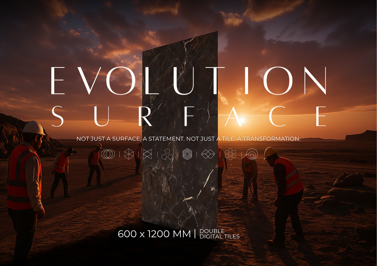
Explore Capron Evolution Surfaces for your next architectural or interior project.