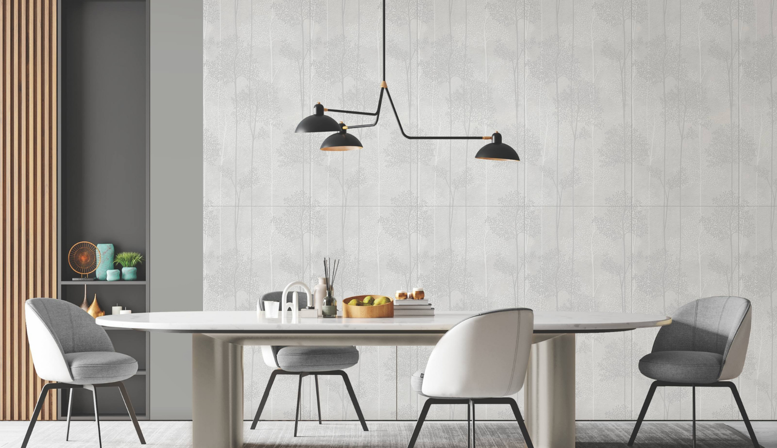



A kitchen is one of the few interiors where the same material decision may need to solve for appearance, cleaning, movement, lighting and visual continuity at once. That is why good kitchen tiles design starts with the architecture of the kitchen rather than a decorative pattern chosen in isolation.
Think of the kitchen as three different surface zones
Instead of selecting one tile and repeating it everywhere, divide the kitchen into three surface conditions: floor, wall and backsplash. Each interacts differently with cabinetry, lighting, appliances and daily use.
| Zone | Main design question | What to evaluate |
|---|---|---|
| Floor | How should the kitchen connect to adjoining spaces? | Scale, joints, movement, maintenance, visual continuity and product suitability. |
| Wall | Should the surface disappear or become architectural? | Colour, texture, vertical proportion, lighting and cabinet relationship. |
| Backsplash | Should it contrast with or extend the worktop? | Cleaning, grout layout, pattern scale, sockets, edges and focal impact. |
1. Kitchen floor tiles should support the whole interior
The floor is usually the largest uninterrupted tiled plane in a kitchen. Its colour and graphic movement therefore influence how cabinetry, counters and furniture are perceived. A quiet floor can support expressive joinery, while a stronger stone or marble-inspired surface can become part of the visual identity of an open kitchen.
For open-plan homes, consider whether the kitchen floor should continue into the dining or living area. A continuous material language can make connected spaces feel more intentional.

2. Large-format tiles can simplify the visual grid
A 600×1200 mm module can reduce the frequency of joints compared with smaller tile formats and create broader visual fields. In contemporary kitchens, this can work especially well with long counters, islands and full-height cabinetry because the tile grid can be coordinated with the architecture.
Large format does not automatically mean better. Designers should first plan cuts around walls, doorways, islands and fixed joinery. The objective is not simply fewer joints, but better-positioned joints.
3. Kitchen wall tiles do not have to look like conventional kitchen tiles
Wall surfaces can be treated as part of the room’s material composition. Instead of limiting the selection to small decorative modules, architects can consider stone-inspired, textured, coloured or large-format surfaces that relate to the rest of the interior.
Capron collections such as AIR, AIR Plus, AIR Pro and Prism provide different ways to introduce texture, colour and surface depth. These are most effective when chosen in relation to cabinetry and lighting rather than as standalone decoration.

4. Use gloss strategically
Glossy kitchen tiles can interact dramatically with daylight, pendants and under-cabinet lighting. Reflection may help a surface feel brighter and more animated, but it also means surrounding objects become visible in the finish.
That makes glossy surfaces especially important to sample in the actual lighting environment. Capron’s PGVT, Ascent and Karbon directions can support projects where reflection is intentionally part of the visual language.
5. Matt and textured surfaces create a quieter response
Where the design calls for less reflection, matt and texture-led surfaces can create depth through shadow and tactile character. AIR Plus combines shape with a matt-granula surface direction, while other Capron collections explore punch, carving and texture-led treatments.
On walls, directional lighting can reveal these details more strongly. Under flat light, the same relief may appear substantially softer.

6. Choose kitchen colours as part of a palette
White, beige and grey remain useful because they are flexible, but a modern kitchen does not need to stop there. The tile can repeat, soften or deliberately contrast the colour of cabinetry.
Prism is particularly relevant where the design requires a wider colour vocabulary. The collection explores shades and decorative expressions that can be considered for more individual interior concepts rather than relying on a single neutral formula.
Light kitchens
White and pale surfaces can reinforce brightness and provide a calm background for timber, metal or coloured cabinetry.
Dark kitchens
Black and deep-toned surfaces can create strong visual weight when balanced with appropriate lighting and contrasting materials. Zed Black and darker Karbon designs can be considered where this direction suits the project.
Warm kitchens
Wood-inspired and earthy surfaces can soften hard architectural lines and work particularly well with warm lighting, natural fabrics and muted cabinetry.

7. Wood-look tiles can bring warmth into contemporary kitchens
Wood is visually effective in kitchens because it offsets glass, metal, stone and painted joinery. Capron’s TRACE collection translates wood-inspired grains, tonal depth and organic movement into a 600×1200 mm tile surface.
Rather than trying to imitate a timber kitchen everywhere, use wood-look surfaces selectively. They can establish warmth on a floor, create a feature plane or help connect the kitchen visually with adjacent living areas.
8. Plan the backsplash around the architecture
A backsplash should be designed before installation begins. Review where the tile will stop, how it meets upper cabinets, whether the pattern aligns with the worktop, and how electrical points interrupt the surface.
A strong backsplash can be created through colour or texture, but restraint is often more effective when the countertop and cabinetry already have pronounced movement.
9. Lighting can completely change the tile
A tile selected under showroom lighting may not read the same way beneath warm pendants, cool task lighting or strong daylight. Gloss becomes more reflective, textured surfaces develop shadow, and colours can appear warmer or cooler.
For specification-led projects, review physical samples beside the actual cabinet, countertop and paint samples under lighting close to the intended final environment.
Kitchen tile specification checklist
- Define floor, wall and backsplash requirements separately.
- Confirm the chosen product is suitable for its intended application.
- Coordinate tile size and joint positions with cabinetry and islands.
- Review the full surface graphic rather than only a small sample.
- Test colour and finish under project lighting.
- Choose grout colour as part of the design.
- Plan corners, edges, sockets and transitions before installation.
- Consider how the kitchen connects visually with adjoining rooms.
Common kitchen tile design mistakes
Matching everything
A coordinated kitchen does not require the floor, wall, worktop and cabinetry to be the same colour. Material hierarchy often creates a stronger result than literal matching.
Choosing the backsplash last
The backsplash is visually connected to the countertop, cabinets, sockets and lighting. Leaving it until the end can result in awkward cuts or an unrelated material choice.
Ignoring reflection
Highly reflective surfaces can be beautiful, but they should be specified with an understanding of what they will reflect.
Using trend alone as the specification
Trends can inspire a palette, but application, maintenance, lighting and long-term material continuity should determine the final selection.
Frequently asked questions
Which tiles are best for a modern kitchen?
There is no single best tile for every kitchen. The right choice depends on whether it is being used on the floor, wall or backsplash, the required performance, the lighting and the overall interior concept.
Are 600×1200 tiles suitable for kitchens?
They can work effectively in modern kitchens where larger visual fields and fewer joints suit the architecture. Layout and cuts should be planned around the room dimensions and fixed cabinetry.
Are glossy tiles good for kitchen walls?
Glossy surfaces can create a bright, reflective wall treatment. Their suitability depends on the specific product and application, and designers should account for reflections and lighting when making the selection.
Can wood-look tiles be used in a kitchen design?
Wood-inspired tiles can introduce warmth and help connect kitchens with dining and living spaces. The specific tile should still be checked for its intended application.
Design the kitchen as a complete material composition
The most successful kitchen tiles design is rarely about finding one fashionable pattern. It comes from understanding how the floor, walls, cabinetry, worktop, light and adjoining rooms work together.
Capron’s surface portfolio gives architects and interior designers multiple ways to build that composition, from glossy and high-gloss expressions to texture, colour, wood-inspired graphics and quieter material directions.
Explore Capron Evolution Surfaces for kitchens designed beyond the expected.