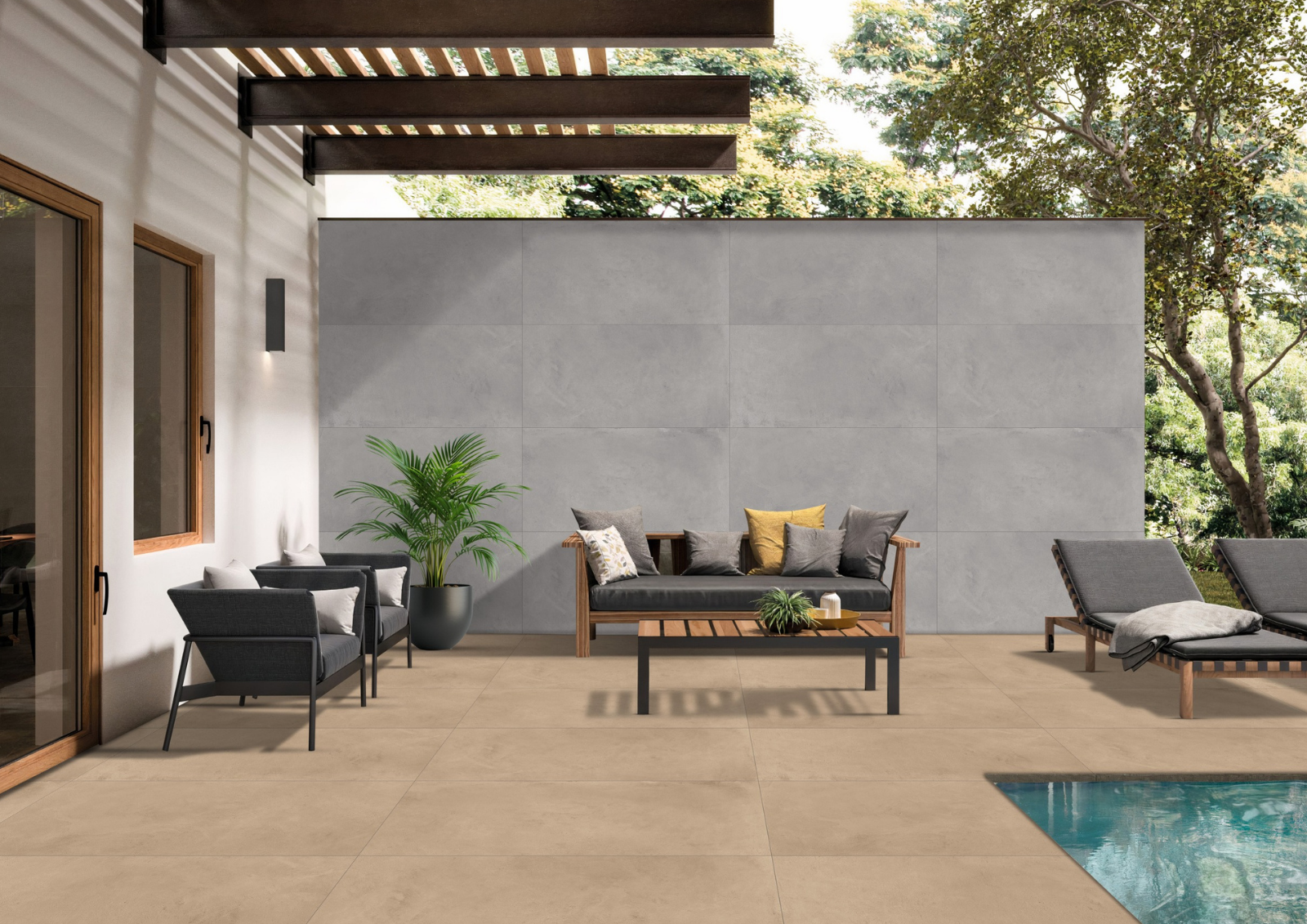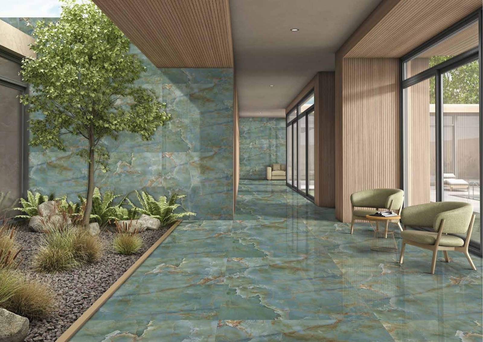



Kitchen walls sit at the intersection of cabinetry, worktops, appliances, lighting and daily activity. That makes kitchen wall tiles design more than a question of choosing a pattern. The strongest results come from treating the tiled wall as an architectural surface and deciding what role it should play in the complete kitchen.
Start by deciding what the kitchen wall should do
Some kitchen walls should remain quiet and support the cabinetry. Others should create contrast, carry texture or become the focal point of the room. Defining that role first makes colour and finish selection much easier.
| Design intention | Surface direction | Consider |
|---|---|---|
| Quiet backdrop | Soft neutral, restrained graphic or matt surface | Cabinet colour, worktop movement and grout visibility |
| Brighter interior | Light-toned or reflective surface | Natural light, artificial lighting and reflections |
| Feature wall | Colour, texture, pattern or strong stone expression | Visual hierarchy and how much of the wall remains visible |
| Warm material palette | Earthy or wood-inspired surface | Timber joinery, flooring and colour temperature of lighting |
1. Choose colour in relation to the cabinetry
A tile colour should not be selected independently from the largest permanent elements in the kitchen. Cabinet fronts, countertop material, hardware and flooring all change how a wall colour is perceived.
Light walls can create a clean visual field behind darker joinery. Deeper colours can add weight to pale kitchens. Earthy tones can soften minimalist cabinetry, while a deliberate colour contrast can turn a simple wall into a defining part of the interior.
Capron’s Prism collection is particularly relevant to colour-led design because it explores a broad spectrum of tones alongside decorative, liner, slate and punch-surface expressions.

2. Texture can make a neutral wall more interesting
A neutral kitchen does not need a highly patterned wall to avoid feeling flat. Texture can create variation through shadow instead of colour. Shape, punch, carving and granular surface treatments can introduce depth while keeping the overall palette controlled.
AIR, AIR Plus and AIR Pro provide useful examples of this approach. When used thoughtfully, a textured wall can become more noticeable as daylight changes or as under-cabinet and directional lighting moves across the relief.
3. Gloss changes the relationship between wall and light
Glossy kitchen wall tiles can make light itself part of the material composition. The surface may reflect windows, pendants, counters and surrounding colours, producing a brighter and more dynamic effect than a matt wall.
That can be highly effective, but the reflection needs to be intentional. Before specifying a glossy or high-gloss surface, designers should consider what will actually appear in it from normal viewing angles.

4. Matt finishes create a more restrained backdrop
Matt surfaces generally produce a quieter response to light. This can work well when the kitchen already contains expressive stone, coloured cabinetry, metallic fittings or strong decorative lighting.
The goal is not to decide that matt is better than gloss. It is to decide whether the wall should reflect light, absorb visual attention or reveal texture through shadow.
5. Think beyond the traditional backsplash strip
A backsplash does not have to stop at a narrow band between the worktop and upper cabinets. Depending on the kitchen architecture, the tiled surface can continue to the ceiling, wrap a return wall or form a larger uninterrupted plane behind open shelving.
This is where large-format modules can become particularly useful. A 600×1200 mm surface can create a different visual rhythm from small-format backsplash tiles and may reduce the number of visible joints across larger wall areas.

6. Plan 600×1200 wall tiles before installation
Large tiles create cleaner visual fields only when the layout is resolved properly. Before installation, map the module against the wall dimensions and identify where cuts will fall around sockets, windows, shelves, cabinetry and corners.
Orientation also changes the composition. Horizontal placement can emphasise width, while vertical placement can strengthen height. Neither is automatically correct; the room proportions should decide.
7. Wood-inspired kitchen walls can add warmth
Contemporary kitchens often combine visually hard materials such as glass, metal, stone and painted boards. A wood-inspired surface can introduce warmth and organic movement into that palette.
TRACE uses wood-inspired grains, knots and tonal variation in a 600×1200 mm tile format. In a kitchen concept, that visual language can work as a feature plane or as a material bridge between kitchen and adjoining dining or living spaces.

8. Grout is part of the kitchen wall design
Grout can either reinforce the tile grid or visually recede. A contrasting grout makes each module more visible, while a closer tonal match can create a more continuous surface.
For large-format wall installations, joint alignment should also be coordinated with cabinetry and architectural lines. A beautifully selected tile can lose impact if joints appear arbitrary around cabinets or openings.
9. Test kitchen wall tiles under the actual lighting
Under-cabinet lights can create strong grazing illumination across a backsplash. Pendants can produce warm highlights. Daylight can reveal colour and texture differently throughout the day. Because of this, the same tile can appear materially different between a showroom and the finished kitchen.
Review physical samples beside the selected cabinet and countertop finishes whenever possible.
10. Use pattern with hierarchy
If the countertop has pronounced veining and the cabinetry has a strong colour, another highly expressive wall pattern may create unnecessary competition. Conversely, a restrained kitchen may benefit from a wall with more visual movement.
The objective is not minimalism for its own sake. It is hierarchy: decide which surface should lead and which surfaces should support it.
Kitchen wall tile specification checklist
- Confirm the tile is suitable for the intended wall application.
- Review the wall together with cabinetry, worktop and floor samples.
- Choose whether the wall should be neutral, reflective, textured or expressive.
- Plan the exact extent of the tiled area.
- Map tile joints around sockets, shelves, windows and cabinetry.
- Review the finish under expected daylight and artificial lighting.
- Select grout colour intentionally.
- Resolve exposed edges, external corners and transitions before installation.
Common kitchen wall tile mistakes
Choosing from a close-up image only
A close-up may show colour and texture but not the scale of the pattern across an entire wall. Always consider the complete surface composition.
Adding too many competing materials
Cabinetry, countertops, hardware and flooring already create multiple visual layers. The wall should strengthen that composition rather than automatically introduce another dominant element.
Ignoring electrical points and openings
Sockets, switches and windows interrupt the tile grid. Their relationship with joints and patterns should be resolved before installation.
Assuming every kitchen wall needs the same treatment
A cooking wall, breakfast counter and full-height feature wall may each benefit from a different surface strategy while remaining part of one material language.
Frequently asked questions
Which tiles are best for kitchen walls?
The right choice depends on the intended application, cleaning requirements, lighting and design concept. Product suitability should always be confirmed for the specific installation.
Are large tiles good for kitchen walls?
Large-format tiles can create broader visual fields and fewer joints. They work best when the module is planned carefully around cabinetry, openings and wall dimensions.
Which colour is best for kitchen wall tiles?
There is no universal best colour. The tile should be evaluated alongside the cabinet, countertop, floor and lighting palette. Light neutrals, darker tones, earthy colours and stronger accent shades can all work in the right composition.
Should kitchen wall tiles be glossy or matt?
Gloss creates stronger reflections and interaction with light, while matt finishes usually create a more restrained response. The intended atmosphere and the specific product application should determine the choice.
A kitchen wall should belong to the architecture
The best kitchen wall tiles do not look selected after the rest of the room was designed. Their colour relates to the cabinetry, their scale relates to the architecture, their finish responds to the lighting, and their joints align with the composition.
Capron’s range of colour-led, textured, glossy and wood-inspired surfaces gives architects and interior designers different ways to build that relationship rather than relying on one standard kitchen-tile formula.
Explore Capron Evolution Surfaces for kitchen walls designed as part of the architecture.