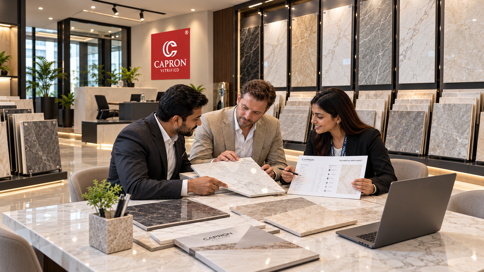



White tiles are often chosen because they feel clean, bright and adaptable. But a successful white interior is rarely created by colour alone. Scale, undertone, gloss, texture, grout, lighting and the materials placed beside white all determine whether the result feels architectural or simply empty.
For architects and interior designers, the real opportunity is to treat white as a material canvas rather than a default background.
Why do some white interiors feel flat?
White becomes visually flat when every surface has the same reflectivity, temperature and texture. A more resolved white interior uses subtle differences: a polished floor against a matt wall, a textured feature surface beside smooth cabinetry, or warm timber and metal against a clean white field.
Instead of asking “Which white?”, begin with “How should this white surface respond to light?”
1. Use gloss when light and reflection are part of the concept
A glossy white surface can reflect windows, artificial lighting and nearby materials, helping the surface feel more dynamic. Capron’s Super White and glossy directions can be considered where a bright, polished expression supports the interior concept.
Reflection should still be reviewed deliberately. What appears in the tile from normal viewing angles becomes part of the room.

2. Use matt white for a quieter architectural background
Where the furniture, stone, art or lighting already carries strong visual character, a restrained white surface can give those elements room to lead. Matt and lower-reflection finishes can create a calmer field than high gloss.
The objective is not to decide that matt is more sophisticated. It is to choose the light response that the room actually needs.
3. Large-format white tiles can make the surface feel more continuous
A white wall or floor divided by many joints can become more graphic than expected. A 600×1200 mm format can reduce joint frequency and create broader planes when it fits the room proportions.
Large format still requires planning. Map joints against doorways, cabinetry, windows, sanitary fittings and corners before installation.

4. Texture prevents white from becoming visually empty
One of the strongest ways to design with white is to let shadow create the variation. Shape, relief, carving and other texture-led surfaces can remain tonally restrained while changing throughout the day as light moves across them.
AIR, AIR Plus and AIR Pro illustrate how surface depth can become a design element without depending on a loud colour palette.

5. Pay attention to the undertone
Not every white reads the same beside other materials. Some whites can appear warmer or cooler depending on lighting and adjacent colours. Place the tile beside the actual paint, cabinetry, countertop, timber and metal samples before final approval.
This is particularly important in open-plan interiors where one white surface may be seen beside several different materials.
6. White tiles and grout: decide whether the grid should disappear
A close tonal grout can help create a more continuous field. A contrasting grout turns the tile module into a visible graphic. Both approaches can work, but the grout decision should be made as part of the design rather than left until installation.
7. Pair white with black for controlled contrast
Black and white can create a strong architectural relationship when the proportion is controlled. Capron Super White can be paired conceptually with Zed Black to create monochrome compositions ranging from a small dark accent to a much stronger graphic contrast.
Use the darker material to define specific planes rather than adding black randomly throughout the room.
8. Pair white with wood-inspired surfaces for warmth
White can feel colder when surrounded only by similarly hard, neutral materials. Wood-inspired surfaces introduce grain, warmer tones and visual softness. TRACE can provide this type of contrast in a tile-based material palette.

9. White tiles in living rooms
In living rooms, white floors or walls can create a flexible base for furniture and art. The key is to add material layering through textiles, timber, stone, metal and lighting so the room does not rely on colour alone for depth.
10. White tiles in kitchens
White kitchen walls can work with almost any cabinet direction, but that versatility makes detailing more important. Consider countertop movement, cabinet undertone, hardware and under-cabinet lighting. Glossy white may create stronger reflection; textured or quieter white surfaces can introduce subtle depth.
11. White tiles in bathrooms
A white bathroom does not need every surface to be identical. Varying scale or texture between walls can create hierarchy while preserving a light palette. For floor applications, always verify the exact product and finish for the intended condition.
White tile design checklist
- Decide whether white should reflect light or remain visually quiet.
- Check the tile’s undertone beside permanent project materials.
- Use texture where a monochrome palette needs more depth.
- Plan the 600×1200 grid before installation.
- Select grout according to whether joints should recede or become visible.
- Review samples in daylight and artificial light.
- Add material contrast through timber, stone, metal, textiles or darker surfaces.
- Confirm product suitability for the intended wall or floor application.
Common mistakes with white tiles
Using the same white finish everywhere
A room can lose depth when every surface responds to light identically. Consider controlled variation in texture and reflectivity.
Assuming all whites match
Adjacent whites can reveal different undertones. Compare physical samples together.
Choosing grout at the last minute
Grout changes the perceived scale and geometry of the surface and should be specified early.
Depending only on white to make a room feel larger
Perceived space also depends on furniture density, lighting, proportions, sightlines and material continuity.
Frequently asked questions
Are white tiles good for modern interiors?
Yes. White can provide a versatile architectural base, but finish, texture, format, grout and surrounding materials determine the final character.
Do white tiles make a room look bigger?
Light surfaces can contribute to a brighter visual field, but perceived size also depends on lighting, layout, furniture, joints and room proportions.
Are glossy or matt white tiles better?
Neither is universally better. Gloss creates stronger reflection, while matt generally produces a quieter response. Choose according to the design intent and product suitability.
What colours work with white tiles?
Black, timber tones, warm neutrals, stone, muted colours and stronger accents can all work. The right combination depends on the project’s overall palette and lighting.
White should feel intentional, not default
The strongest white interiors use scale, light, texture and contrast to create depth. White becomes more powerful when it has a clear architectural role rather than being selected simply because it feels safe.
Capron Super White and complementary Evolution Surfaces give designers multiple ways to build bright interiors while still creating material character.
Explore Capron Evolution Surfaces for white interiors designed with depth, light and intention.