


Porcelain tiles vs vitrified tiles can be a confusing comparison because the terms are not always used in exactly the same way across markets. For a designer, the useful question is therefore not simply which name sounds more technical. It is what the exact product is made to do, where it will be installed, what finish it carries and how its format supports the architecture.
First, understand the terminology
Porcelain and vitrified tiles are closely related dense ceramic surface categories, and market terminology can overlap. Instead of relying on the product name alone, architects and interior designers should review the manufacturer’s technical information for the exact tile being specified.
That approach avoids an oversimplified “porcelain is better” or “vitrified is better” answer and shifts the decision toward measurable suitability and design intent.
Porcelain vs vitrified tiles at a glance
| Question | Porcelain tiles | Vitrified tiles |
|---|---|---|
| What are they? | A dense ceramic tile category commonly associated with low water absorption. | A dense ceramic tile produced through vitrification; terminology and product classifications can vary by market. |
| Can they be used on floors and walls? | Potentially yes, but the exact product, finish, substrate and installation system must be suitable for the application. | |
| Do they come in large formats? | Large formats are available in contemporary tile markets. Always verify the dimensions of the selected product. | |
| Do they all perform the same? | No. Product-specific technical data matters more than a broad category name. | |
| What should designers compare? | Application, technical properties, finish, format, surface design, maintenance, lighting and installation requirements. |
|
1. Density and water absorption are important starting points
Both terms are associated with dense ceramic tile bodies and low water absorption. But for specification, a general category description is not enough. Wet areas, exterior conditions, high-traffic spaces and other demanding applications should be evaluated against the technical documentation for the exact product.
This distinction is important because visual similarity does not guarantee identical performance.

2. Finish changes the experience of the surface
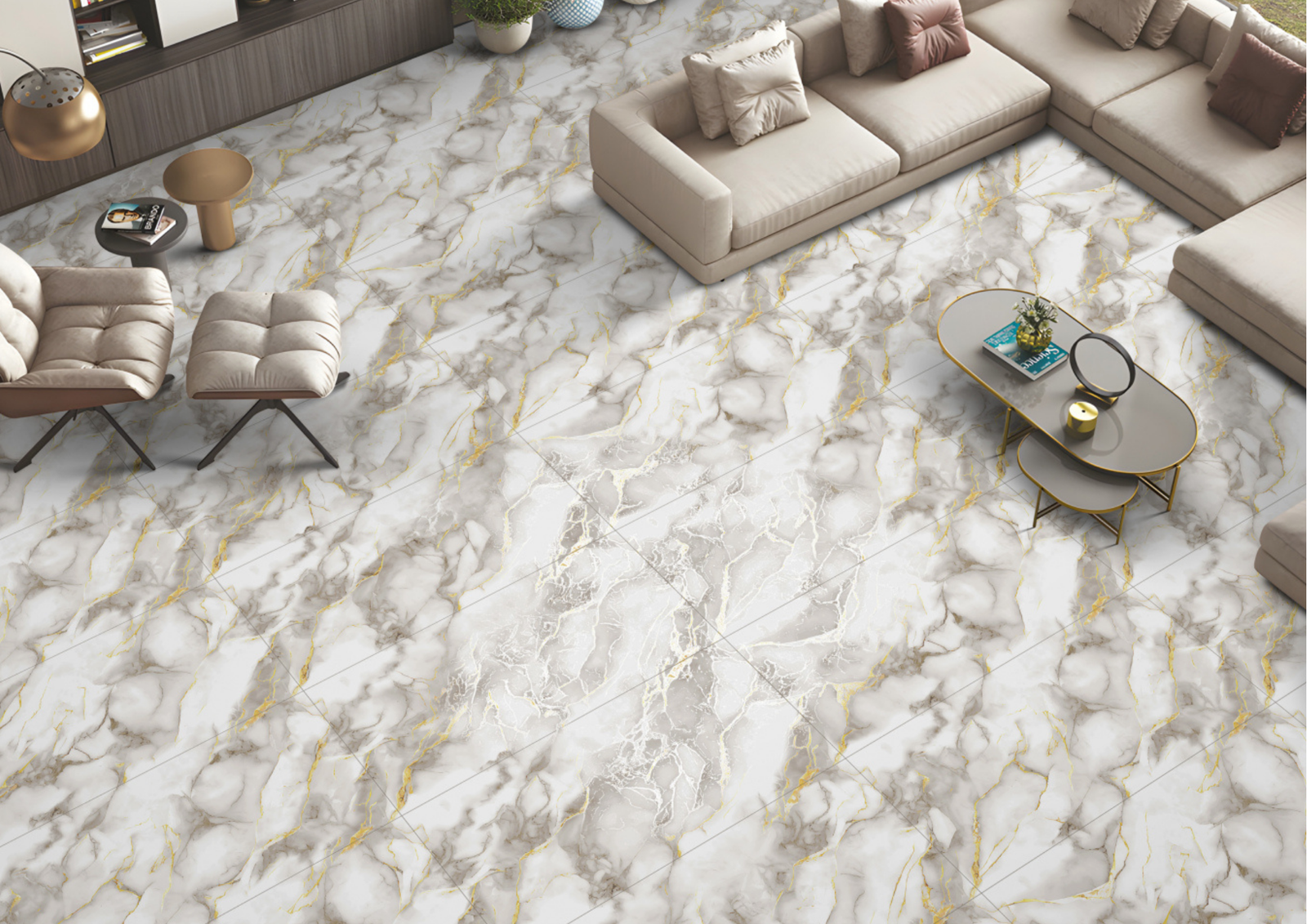
Once the technical requirements are satisfied, finish becomes a major design decision. A polished or glossy tile interacts with windows, lighting and furniture through reflection. A matt surface is generally quieter. A textured or shaped surface creates depth through relief and shadow.
Capron’s PGVT direction illustrates the reflective end of that spectrum, while AIR, AIR Plus, AIR Pro, CORE and Origin explore different forms of texture and surface character.
3. Large-format tiles change visual scale
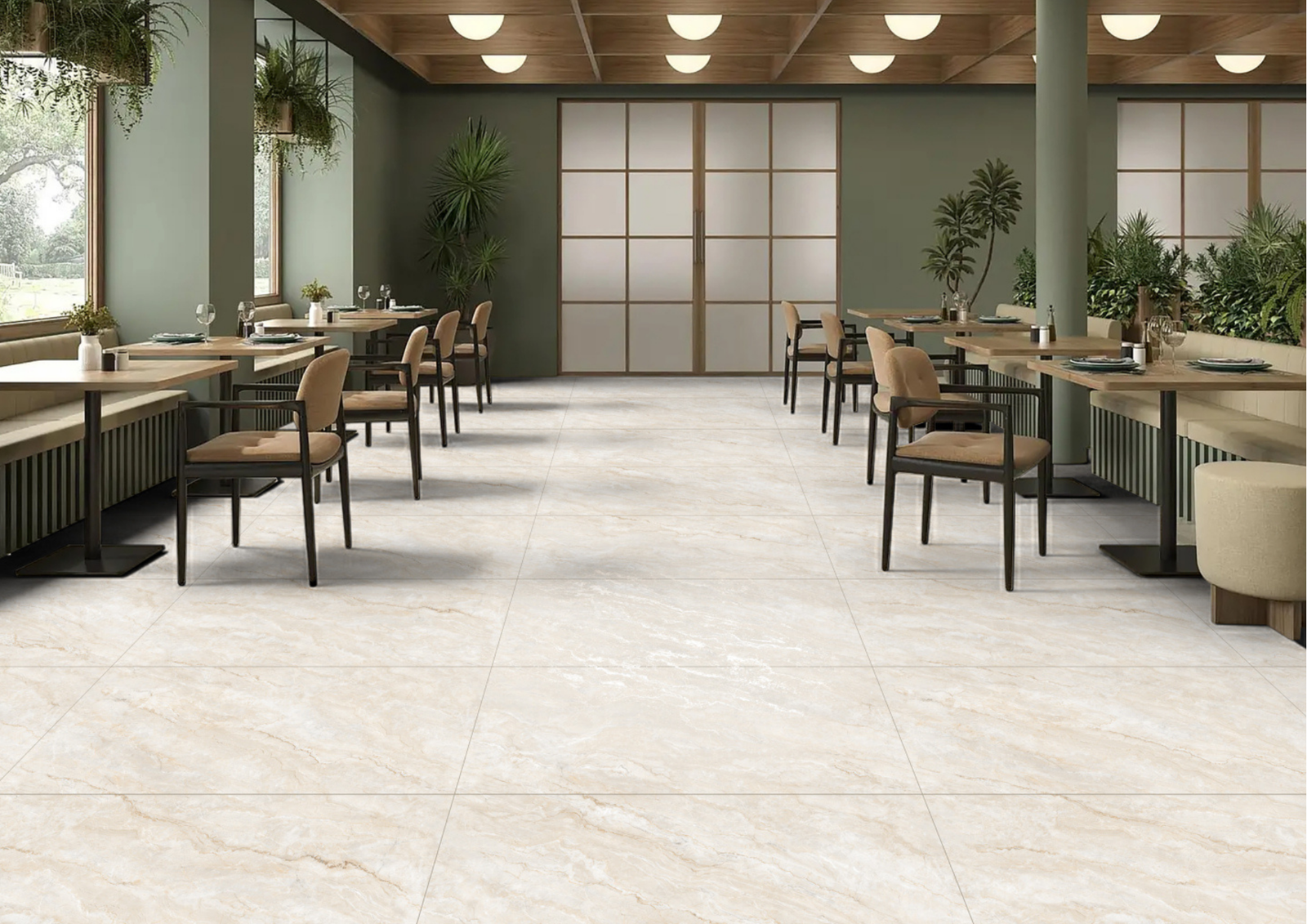
For contemporary interiors, format can matter as much as the material label. A 600×1200 mm tile produces a different grid from smaller modules. With thoughtful planning, larger modules can create broader material planes and reduce visual fragmentation.
Before specifying large-format tiles, designers should map joints, cuts, doorways, cabinetry, sanitary fittings and corners. Large format works best when the layout is resolved as part of the architecture.

4. Surface design can imitate very different materials
Dense ceramic surfaces are no longer limited to a narrow stone aesthetic. Contemporary collections can interpret marble, rock, timber, colour, geometric pattern and more abstract textures.
This is why architects should review the complete design language rather than selecting only by category. A wood-inspired surface and a high-gloss marble interpretation may both sit within the broader vitrified world while creating completely different interiors.
5. Porcelain or vitrified tiles for living spaces?
For living rooms and connected residential spaces, consider the visual scale of the floor or wall, the amount of natural light, furniture palette, maintenance expectations and how the surface continues into adjoining areas.
Where a project uses 600×1200 mm surfaces, joint planning can become an important part of creating continuity across the interior.

6. What about kitchens and bathrooms?
In kitchens and bathrooms, the comparison should move beyond appearance. Designers should check the exact product’s intended application and consider wet conditions, cleaning, installation, joints and the chosen surface finish.
On walls, designers have more opportunities to use reflection, texture and colour as part of the composition. On floors, performance requirements and the specific installation condition need careful attention.
7. What about commercial and high-use spaces?
Commercial spaces introduce another set of variables: traffic, cleaning cycles, maintenance expectations and long-term visual consistency. The category name alone cannot answer those requirements.
Performance-oriented collections such as Capron CORE can enter the conversation when the application calls for a more function-led surface direction, but the selected product should still be checked against project-specific requirements.

How architects should actually compare two tiles
- Start with application: floor, wall, wet area, dry area, residential or commercial.
- Read the technical sheet: compare the exact products rather than generic category claims.
- Evaluate finish: gloss, matt, texture and relief change the interaction with light.
- Review format: determine how the module fits the dimensions and architectural grid.
- Check surface variation: review multiple faces or larger samples where relevant.
- Test with project materials: place the tile beside joinery, stone, paint and metal samples.
- Plan installation: grout, joints, cuts, transitions and corners should be resolved early.
Which one should you choose?
The strongest specification is not based on choosing a winner between porcelain and vitrified tiles. It comes from comparing the actual products against the requirements of the space.
| If the project needs… | Prioritise… |
|---|---|
| A visually continuous modern interior | Format, joint layout, surface variation and transition planning. |
| A reflective luxury expression | Gloss/high-gloss finish, lighting and reflection control. |
| A quieter architectural surface | Matt finish, restrained graphics and tonal coordination. |
| Texture and depth | Relief, shape, carving or punch treatment and directional lighting. |
| A demanding application | Product-specific technical data and installation requirements. |
Common mistakes
Choosing by terminology alone
Two products carrying different category labels may be closer in practical characteristics than the names suggest. Compare the specifications.
Assuming every tile in a category has identical performance
Finish, body, product range and intended application can differ. Use the data for the exact product.
Ignoring lighting
A high-gloss surface and a textured matt surface can react completely differently under the same lighting plan.
Ignoring the installation grid
Even a strong surface selection can look unresolved if joints, cuts and transitions are treated as an afterthought.
Frequently asked questions
Are porcelain and vitrified tiles the same?
The terms describe closely related dense ceramic tile categories, and usage can overlap depending on the market. For specification, use the exact manufacturer’s product classification and technical data.
Which is better, porcelain or vitrified tiles?
Neither category is universally better. The correct choice depends on the specific product, application, finish, format and project requirements.
Can vitrified tiles be used for walls?
Yes, where the selected product and installation system are appropriate for wall use. Large-format wall installations require proper planning and handling.
Are 600×1200 tiles suitable for modern interiors?
A 600×1200 mm module can create broad visual planes and a more controlled joint rhythm. Whether it suits a project depends on room dimensions, layout and installation planning.
Specify the product, not the label
The porcelain tiles vs vitrified tiles question becomes much easier once the project is approached as a surface specification problem. Determine what the space requires, verify the technical data, then select the scale, finish, colour and texture that support the architecture.
Capron Evolution Surfaces offers multiple 600×1200 mm design directions for architects and interior designers who want to move beyond a one-finish-fits-all approach.
Explore Capron Evolution Surfaces for your next architectural or interior project.