


Ordinary tile selection begins with colour. Better surface specification begins with the space.
For an architect or interior designer, a tile is not an isolated decorative object. It becomes part of a larger system involving scale, circulation, light, furniture, joints, transitions, maintenance and the visual rhythm of the architecture.
This is one reason the 600x1200mm tile format has become such a useful design module. It is large enough to create visual continuity and give textures or veins room to develop, yet flexible enough to work across walls, floors and a wide range of residential and commercial applications.
The real advantage, however, is not the dimension alone. It is what designers can do with that dimension.

600x1200mm Is More Than a Tile Size. It Is a Design Module.
At 600mm by 1200mm, the proportion is immediately useful for architectural planning. The rectangular geometry can align with long walls, cabinetry, furniture axes and linear circulation in ways that a smaller square format often cannot.
Used horizontally, the tile can visually widen a wall or reinforce the length of a corridor. Used vertically, it can emphasise height and create a more monolithic feature surface.
For flooring, the larger module means fewer repeated joints across the same area. That reduction in visual interruption can make the floor read as one continuous plane rather than a dense grid.
1. Fewer Joints Create a More Controlled Visual Rhythm
Grout lines are part of the design whether they are considered or not.
In a smaller format, repeated joints create a stronger grid. In a 600x1200mm layout, fewer joints can allow the eye to focus more on material, furniture and proportion.
This is particularly useful in minimal interiors, premium residences, hospitality projects and retail environments where too much surface segmentation can compete with the architectural intent.
The effect becomes even stronger when grout colour, joint width and laying direction are coordinated with the tile rather than treated as installation details at the end of the project.
2. Large Format Gives Veins, Textures and Graphics More Space
A sophisticated surface often depends on movement across the tile. Stone veining, soft tonal shifts, geometric relief or botanical graphics need enough area to be understood.
The 600x1200mm format gives these details room to develop before a joint interrupts them.
For designers, this means the material can be specified for its complete surface language rather than simply its colour.

3. The Finish Should Be Specified with the Lighting Plan
The same colour can perform very differently depending on the finish.
A glossy surface can amplify reflection and brightness. A matt finish can create a quieter visual field. A shaped or textured surface can generate changing shadows. A wood-inspired grain can soften an otherwise hard material palette.
For this reason, tile selection should ideally happen alongside lighting decisions rather than after them.
| Surface Direction | What Light Does | Design Effect |
|---|---|---|
| Glossy / Polished | Reflects more direct and ambient light | Brighter, more luminous, visually polished |
| Matt | Produces softer reflection | Controlled, calm and understated |
| Shape / Textured | Creates highlights and shadows across relief | Tactile depth without relying only on colour |
| Wood Look | Emphasises linear grain and tonal variation | Warmer and more material-led |
4. Texture Can Replace Excess Decoration
One of the most useful roles of a textured tile is its ability to add depth without adding another colour, pattern or decorative object.
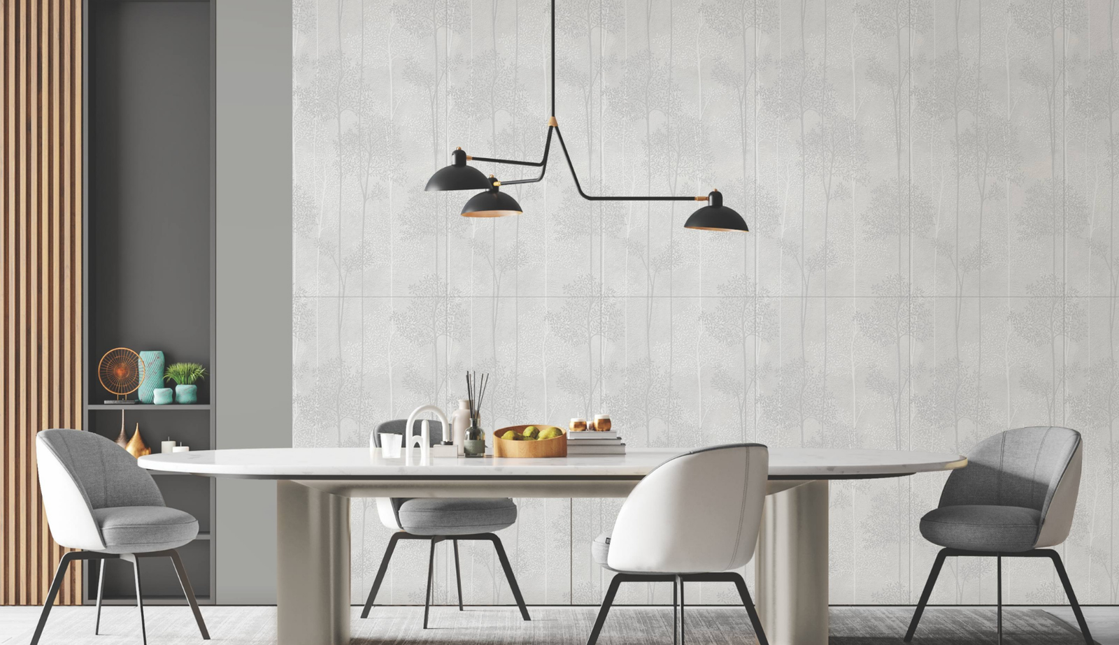
In a restrained interior, a wall can remain beige, ivory, grey or stone-toned while the surface itself creates interest through relief.
This can be especially effective behind reception desks, dining areas, beds, sofas or display walls where a designer wants architectural character but does not want the material to overpower the rest of the space.
Capron’s surface ranges demonstrate this across different treatments, including Shape finishes and other tactile formats in 600x1200mm.
5. Performance Must Be Part of the Design Brief
A surface that works in a formal living room may not be the right choice for a balcony, high-traffic commercial passage or pool-adjacent area.
Specification should therefore begin with the expected conditions of use: movement, moisture, cleaning frequency, abrasion, traction requirements and whether the surface is being used on a wall or floor.
Capron’s Core Collection, for example, uses a 600x1200mm format with an anti-scratch surface and punch texture. Its catalogue references applications such as bathrooms, balconies, pool decks and commercial walkways.

6. One Format Can Support Material Continuity Across a Project
Consistency in module can help architects build a stronger material language across multiple zones.
A 600x1200mm format can move from living spaces to hospitality areas, wall applications and selected commercial environments while the finish changes according to function.
That does not mean using the same tile everywhere. It means maintaining a common scale while allowing the surface character to respond to each space.
For example, a project might use a quieter floor in public areas, a stronger textured wall at reception, and a wood-inspired surface in a lounge, all while retaining the same overall dimensional discipline.
7. Wood-Look Surfaces Add Warmth Without Changing the Module
Architectural interiors frequently combine hard materials such as glass, metal, stone and ceramic. Without contrast, the result can become visually cold.
A wood-inspired tile introduces warmth and linear movement while remaining within the same tile-based material system.
Capron’s Trace Collection uses the 600x1200mm format and translates wood characteristics such as grain, tonal depth and organic variation into a tile surface.

How Interior Designers Can Use 600×1200 Tiles More Intentionally
Use orientation to influence proportion
Horizontal placement can reinforce width. Vertical placement can reinforce height. The same tile can therefore change the perceived proportion of a wall depending on how it is laid.
Align joints with architectural elements
Where possible, coordinate tile joints with cabinetry, niches, vanities, openings, wall edges or major furniture lines. Random cuts can weaken the visual clarity of an otherwise strong surface.
Choose where the eye should stop
Not every wall needs to be a feature wall. Give visual priority to selected areas and allow supporting surfaces to remain quieter.
Review multiple faces before approval
For stone, marble or wood-inspired designs, one sample does not reveal the complete installation. Review the available faces and understand how tonal or graphic variation will appear across the final area.
Design the grout, do not just select it
A contrasting grout can emphasise the module. A closely matched grout can make the installation read more continuously. Both are valid, but the decision should be deliberate.
600×1200 Tile Specification Checklist for Architects
| Specification Item | Question to Resolve |
|---|---|
| Application | Is the surface intended for a wall, floor, feature area, wet zone or higher-traffic environment? |
| Format | How will 600x1200mm relate to the room dimensions and architectural grid? |
| Orientation | Should the tile run horizontally or vertically? |
| Finish | How will the surface respond to natural and artificial light? |
| Performance | What resistance, traction, maintenance or usage requirements apply? |
| Faces / Variation | How much visual variation is desired across the installed area? |
| Grout | Should the joint disappear visually or become part of the grid? |
| Transitions | How will the surface meet other materials, rooms or levels? |
| Mock-up | Has the selected surface been reviewed under actual project lighting? |
Common Specification Mistakes
Choosing from a single sample
A small sample may show colour but not scale, repetition, face variation or the relationship between texture and light.
Specifying the same finish everywhere
Consistency is useful, but function still matters. Different areas may require different surface properties even when the design language remains connected.
Ignoring the setting-out plan
An expensive surface can still look unresolved if joints, edge cuts and transitions are not planned before installation.
Treating grout as a contractor decision
Joint width and grout colour materially affect the final visual result and should be included in the design conversation.
Overdesigning every surface
When every floor and wall is visually dominant, there is no hierarchy. Strong interiors often balance one expressive surface against several quieter ones.
The Opportunity Is Not Bigger Tiles. It Is Better Surface Thinking.
The value of the 600x1200mm format is not that it is simply larger than a conventional tile.
Its value is that it gives architects and interior designers enough scale to think about surfaces more deliberately: how they align, how they respond to light, how texture replaces decoration, how one material transitions into another and how performance supports the intended use of the space.
Capron Vitrified’s Evolution Surfaces use this format across multiple design directions, allowing specifiers to move between polished, textured, performance-focused and wood-inspired surfaces without treating every room as a separate visual language.
Frequently Asked Questions
Why do architects use 600×1200 tiles?
The format gives designers a larger uninterrupted surface, fewer repeated joints and enough area for veins, texture and graphic movement to develop more clearly.
Can 600×1200 tiles be used on both walls and floors?
Many 600×1200 surfaces are developed for wall and/or floor applications, but the recommended use depends on the specific product and its technical characteristics. Always confirm the intended application before specification.
Are large-format tiles suitable for commercial interiors?
They can be, provided the selected surface meets the performance requirements of the project. Traffic, maintenance, traction and exposure conditions should all be considered.
How should grout be selected for 600×1200 tiles?
Grout colour and joint width should support the design intent. A close colour match can create a more continuous surface, while stronger contrast can emphasise the tile module.
Do textured tiles need special lighting?
They do not require special lighting, but directional or grazing light can reveal surface relief more clearly. Reviewing samples under the project’s actual lighting conditions is useful before final approval.
What should architects check before specifying a tile?
Review size, finish, intended application, performance requirements, pattern or face variation, laying direction, grout strategy, transitions and the final effect under project lighting.
Explore Capron Evolution Surfaces for your next architectural or interior project.
Specify beyond colour. Consider scale, texture, light, performance and the way the surface contributes to the complete space.