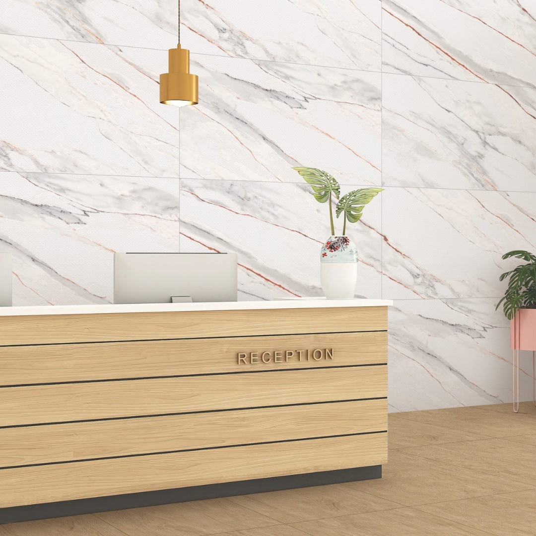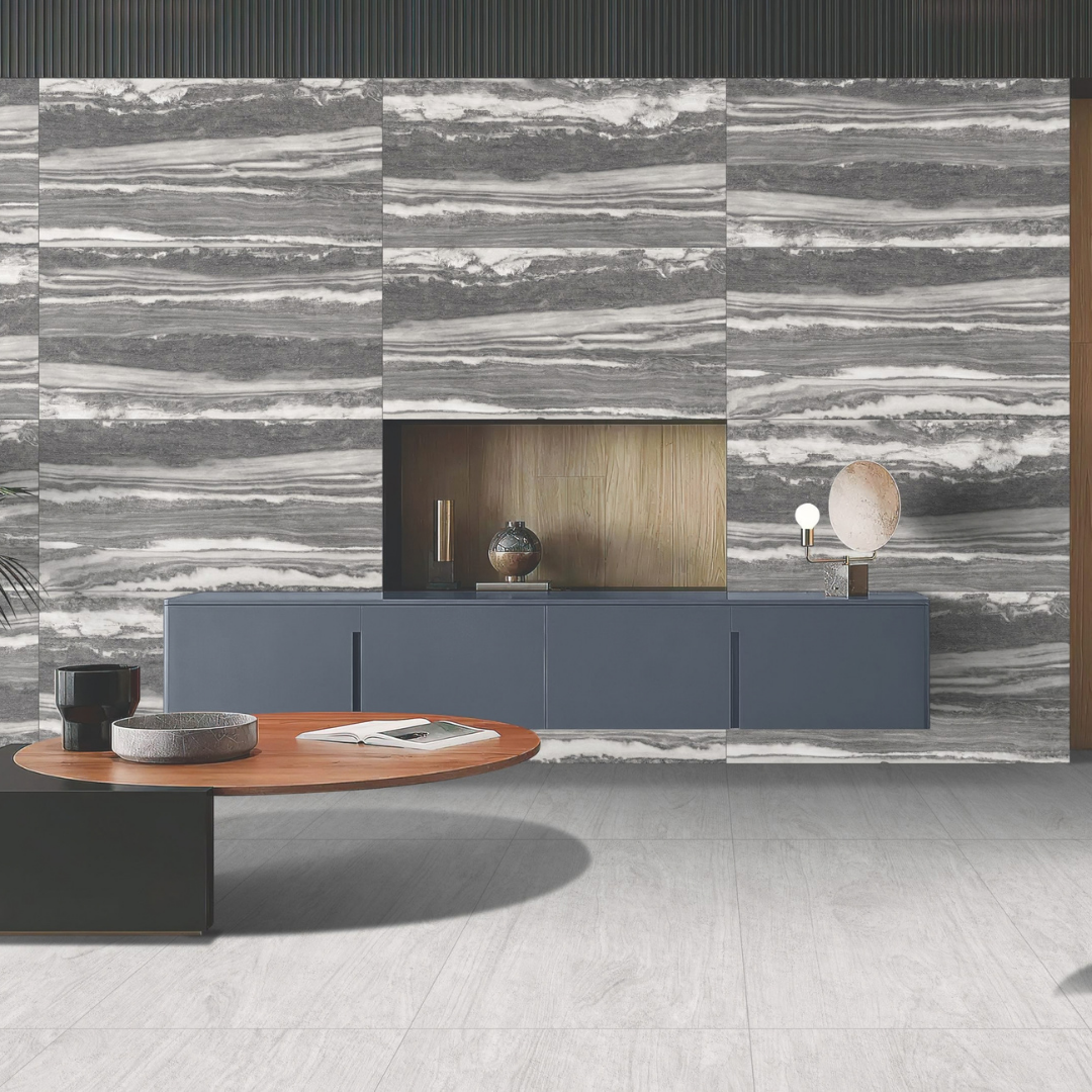


A compact bathroom with no window. A city apartment bedroom that faces a wall. A hotel corridor, a basement showroom, an office cabin lit only from above. Architects and interior designers meet these rooms on almost every project, and the same questions come up each time: which tile colour will make the space feel bigger, should the palette be warm or cool, and should the finish be glossy or matt? This guide gives a practical way to decide.
Why small and low-light rooms are harder to get right
In a large, sunlit room, almost any tile colour works, because daylight fills the space from several directions. In a small or dim room, the floor and walls are a large share of everything you see, and most of the light comes from fittings rather than windows. That means three things matter more than usual:
- How much light the tile reflects. A light tile bounces more light back into the room; a dark tile absorbs it.
- The colour of the light itself. The same tile can look creamy under warm lamps and grey under cool ones.
- The finish. Gloss throws light back as reflections and highlights; matt spreads it softly.
Get these three right and a small room can feel calm and open. Get them wrong and even a well-chosen colour can look flat, cold or dull.
Start with light reflectance, not the colour name
Designers often describe colours by name, such as ivory, sand or ash, but the more useful measure in a small room is Light Reflectance Value (LRV). LRV indicates how much light a colour reflects, on a scale of 0 (black, total absorption) to 100 (white, total reflection). (Formica Group, A guide to LRV in interior design) Two tiles that both look "light grey" in a showroom can behave very differently in a windowless room if one reflects much more light than the other.
Practical rule: in a small or low-light room, use the lighter, higher-reflectance tile for the largest surfaces, usually the floor and the main walls, and keep darker tones for small accents.
Warm neutrals vs cool greys
Both can work in a small room. The choice depends on the light the room actually gets and the mood you want.
Warm neutrals (creams, beiges, sand and soft taupe tones) tend to make a dim room feel more welcoming. They work well:
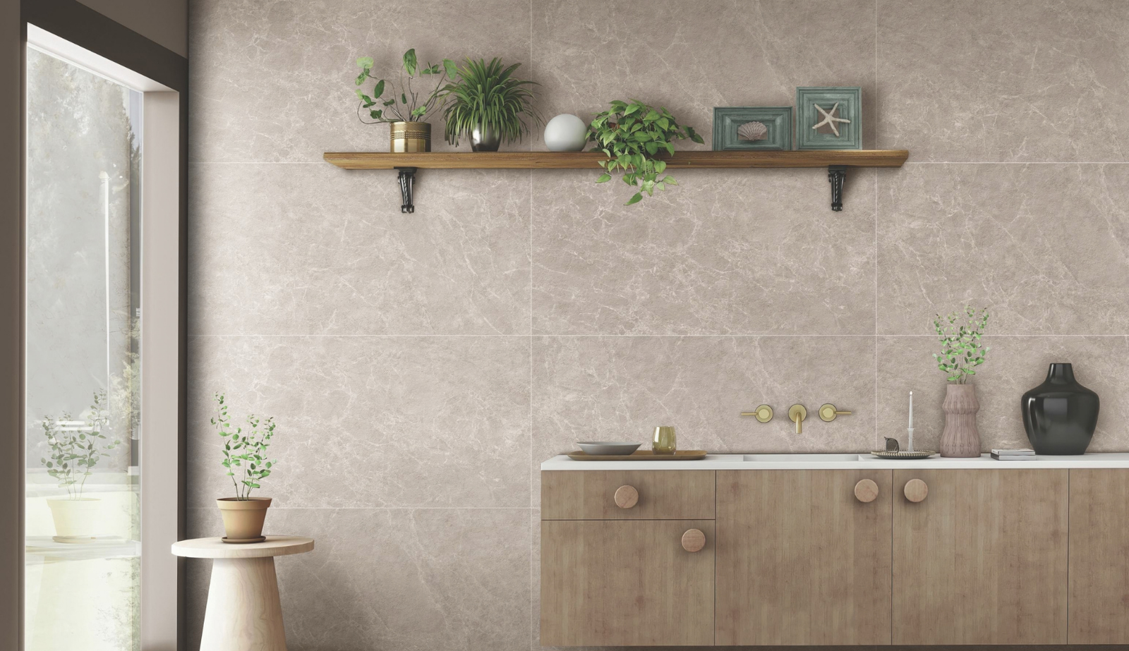
- in rooms lit mainly by warm artificial light, such as bedrooms, living areas and hotel rooms;
- where the room gets little or no direct sun and can feel cold;
- with wood-look surfaces, brass or bronze fittings, and warm-toned fabrics.
Cool greys (light greys, stone greys and grey-whites) tend to look crisp, clean and contemporary. They work well:
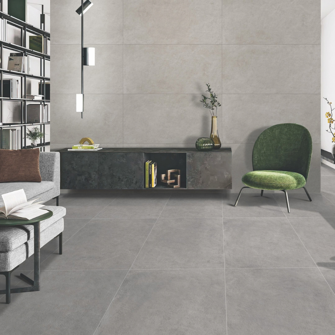
- in rooms with strong, bright light, including cooler white artificial light;
- in offices, clinics, retail and bathrooms where a clean, precise look is the goal;
- with chrome, black metal, glass and white sanitaryware.
The risk with cool greys in a dim room is that they can read as dull or cold if the light is weak. The risk with warm neutrals is that they can look yellow under very warm lamps. That is why you should always judge tile colour together with the light it will be seen in.
Check the lighting before you approve the colour
The colour of "white" light is described by its correlated colour temperature, measured in kelvin (K). Lower colour temperatures look warm and yellowish; higher ones look cool and bluish. (US Department of Energy, LED Color Characteristics)
Practical rule: ask the lighting designer or electrical consultant for the planned colour temperature of the fittings, then view tile samples under a lamp of the same type before you sign off. A warm neutral that looks right under warm light can look flat under cool light, and the reverse is true for cool greys.
Gloss or matt in a small room?
Glossy surfaces bounce light around and can make a small room feel brighter and larger, especially on walls. Capron's GLOSSY (PGVT) range is designed around this: "where reflections create perfection". For decorative walls, ASCENT offers an ultra-smooth surface with high light reflection in brighter shades, while KARBON offers the same high reflection in darker shades. Both are ideal for decorative surfaces and are not recommended for heavy-traffic or slip-risk areas.
Watch for glare and slip. In a room lit by one strong fitting, a glossy floor can show hot spots and reflections. On wet floors, ramps and stairs, gloss is the wrong choice. Building codes reflect this: New Zealand's Acceptable Solution for access routes, for example, does not accept smooth or polished glazed ceramic tiles for wet level surfaces, slopes or stairs. (BRANZ Bulletin 626, Slip resistance of floors)
Matt surfaces spread light evenly, hide reflections and feel calmer, which suits bedrooms, offices and busy floors. A good combination in a small room is a light matt floor with a light glossy wall, so the walls reflect light while the floor stays safe and easy to maintain. For more on this choice, see our architect's guide to glossy vs matt tiles.
Marble-look, wood-look or stone-look in a small space
Marble-look surfaces bring light and a premium feel to compact bathrooms and powder rooms. Keep the veining soft and the background light, so the pattern does not crowd the room. Capron's FLUX series blends natural stone aesthetics with modern applications, in smooth, satin and marble finishes, with marble patterns and inlay designs. It is advisable for home interiors and bathrooms, but not for high-traffic areas.
Wood-look surfaces add warmth to a dim room and pair naturally with warm neutrals. In a small space, one wood-look wall is often enough. Capron's TRACE series is specially designed for wooden designs, in a matt surface with louver-type punch, and is advisable for walls and elevations.
Stone-look and plain colours give the calmest result, which is useful when the room is already busy with fittings or furniture. Capron's PRISM series offers 14 unique glazed colours, engineered to match the look and durability of full-body tiles and suitable for floors, elevations and bathrooms, with options including PRISM PLAIN MATT. PRISM is always available in stock, which helps when a project needs one consistent colour across several rooms.
Large-format 60x120 in small rooms
It may seem logical to use small tiles in a small room, but large formats often work better. Fewer joints mean fewer lines to break up the floor or wall, so the surface reads as one calm plane and the room feels larger. Capron's lead size is large-format 600×1200 mm. Run the long side of the tile along the longest dimension of the room, and use a grout colour close to the tile colour to keep the surface continuous. For more on the format itself, see why architects are specifying 600x1200 tiles.
Room-by-room recommendations
Small or windowless bathrooms. Use a light colour on the walls and a light, slip-conscious floor. Capron's NOVA series has an anti-scratch GHR (leather-touch) surface and is designed for bathroom floors, balconies, terraces, pool decks and swimming pool changing rooms. Pair it with a lighter wall tile, and use one feature wall rather than tiling every surface in a strong pattern.
Compact kitchens. Keep the floor and backsplash in the same colour family so the room does not feel cut up. A warm neutral suits wood cabinetry; a cool grey suits white or handle-less modern kitchens.
Corridors, lobbies and passages. These are often narrow, artificially lit and heavily used. Choose a light colour for brightness and a surface built for traffic. Capron's VERSE is an anti-scratch matt surface for high-traffic areas, and NOVA is described as one of our best products for high-traffic areas.
Hotel rooms and corridors. Warm neutrals under warm lighting help rooms feel restful. Keep the corridor floor practical and use wall tiles to add character.
Showrooms and offices without daylight. Cool greys and light neutrals keep the space bright and clean. A single textured feature wall, such as one of Capron's AIR, AIR PRO or AIR PLUS 3D/4D designs, can add depth; side lighting brings out the surface relief.
Parking and service areas. These are often dim and need durability first. Capron's CORE series is designed for house and office parking, is anti-scratch and acid-proof, and is capable of handling car weight and bike stands.
Where dark tiles still work
Dark tiles are not banned from small rooms. Used on one surface, such as a vanity wall or a niche, a dark tile can add depth and make lighter surfaces look brighter by contrast. Capron's ZED BLACK comes in a glossy finish and an anti-scratch matt finish. Keep the floor and remaining walls light, and add good lighting on the dark surface. For more ideas, see how to use dark surfaces without making spaces feel smaller.
A quick specification checklist
1. Measure the light. Note windows, orientation and the planned colour temperature of the fittings.
2. Choose the reflectance first. Pick a light, high-reflectance tile for the largest surfaces.
3. Decide warm or cool to suit the light. Warm neutrals for warm light and cosy rooms; cool greys for bright light and crisp interiors.
4. Match finish to use. Gloss on walls and dry decorative areas; matt or textured, anti-scratch surfaces on busy or wet floors.
5. Keep patterns calm. Soft veining, one feature wall and large formats with matching grout.
6. Test samples on site. View full-size samples in the actual room, under the actual lighting, at different times of day.
Frequently asked questions
What tile colour makes a small room look bigger?
Light colours with high light reflectance, used on the floor and main walls, usually make a small room feel larger. Large-format tiles with matching grout help further.
Are grey tiles a good choice for a dark room?
They can be, if the grey is light and the room has bright, cooler-toned lighting. In a dim room with warm light, a warm neutral often looks better.
Should I use glossy tiles in a small bathroom?
Glossy tiles work well on bathroom walls, where they reflect light. For the floor, choose a surface meant for wet areas, such as Capron's NOVA.
Can I use 60x120 tiles in a small room?
Yes. Large formats reduce grout lines and make the surface look continuous. Ask us which designs are available in 60x120 for your project.
Request samples or a catalogue
Choosing colour for a small or low-light room is easier with real samples in hand. Capron Vitrified, established in 2016, is an ISO and CE certified manufacturer in Morbi, India, working with 200+ dealers, architects, interior designers and developers. Our surfaces are designed for how spaces are actually used, combining a luxury look with performance and easy maintenance.
Architects and interior designers: request samples or our latest catalogue, including our 60x120 range, through capronvitrified.com or on WhatsApp at +91 76220 25593. Tell us the room type, size and lighting, and our team will suggest suitable Capron surfaces for your project.