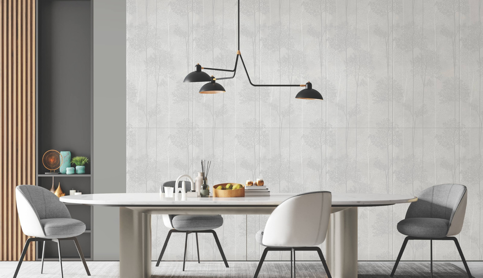



Flooring is one of the largest uninterrupted surfaces in an interior.
It connects rooms, frames furniture, reflects light, guides movement and often determines whether a space feels calm or visually fragmented.
For architects and interior designers, understanding how to choose floor tiles is therefore less about selecting a colour and more about creating a surface strategy around scale, finish, traffic, lighting, joints and long-term use.

Start with the Space, Not the Til
The best flooring decision begins with the architecture.
A living room, retail store, hotel lobby and bedroom may all use vitrified tiles, but they do not need the same finish, colour or performance characteristics.
| Space | Primary Requirement | Flooring Direction |
|---|---|---|
| Living Room | Visual continuity, comfort, easy maintenance | Large-format neutral, stone-inspired or soft glossy surface |
| Bedroom | Warmth, calm atmosphere | Matt, wood-inspired or soft neutral surface |
| Commercial Interior | Traffic, durability, maintenance | Performance-led or anti-scratch surface |
| Hotel Lobby | Scale, impact, repeated movement | Large-format polished or controlled statement floor |
| Café / Restaurant | Spills, chairs, high footfall | Durable matt or performance-focused surface |
Choose the Tile Size According to the Architecture
Tile size affects more than the number of joints. It changes how the floor is read as a plane.
A 600x1200mm format can reduce visual fragmentation and give veins, tonal variation and surface movement more room to develop. In larger spaces, this can create a cleaner and more architectural result.
The format should still be planned around room dimensions, furniture, circulation and transitions. Large tiles do not remove the need for setting-out. They make setting-out more important.
Glossy vs Matt Floor Tiles
Finish determines how the floor responds to light and how strongly it participates in the interior.
| Finish | Visual Effect | Best Considered For |
|---|---|---|
| Glossy | Reflective, brighter, polished | Formal living spaces, selected lobbies and showrooms |
| Matt | Soft reflection, quieter material presence | Minimal interiors, bedrooms and calm residential spaces |
| Textured | Tactile, stronger shadow and depth | Selected high-use or design-led zones |
| Wood-Look | Warm, linear, natural | Bedrooms, lounges and warm contemporary interiors |
High-Traffic Areas Need a Different Floor Strategy
Not all floors experience the same level of use.
A hotel corridor, café, showroom or busy family entrance may deal with much more abrasion, dirt and movement than a bedroom or formal living space.
In these areas, architects should consider resistance to everyday marks, cleaning frequency, furniture movement and actual traffic levels.
Capron’s Core Collection uses an anti-scratch surface with punch texture in 600x1200mm and is positioned for high-traffic applications.

Colour Changes the Perception of Space
Floor colour influences how large, grounded, warm or dramatic an interior feels.
Light floors
Can support brighter, more open interiors and work well with darker furniture or joinery.
Mid-tone stone colours
Often create a balanced, architectural base without becoming too dominant.
Dark floors
Can create drama and visual weight but need to be coordinated carefully with lighting and room size.
Warm beige and earthy tones
Can soften contemporary interiors and make them feel less clinical.
Wood-Look Flooring Adds Warmth Without Changing the Material System
Some interiors need the warmth and rhythm of timber but benefit from the consistency of tile.
Capron’s Trace Collection is inspired by natural wood grains and uses a 600x1200mm format with soft grain movement, knots and tonal variation.

For architects, grain direction becomes part of the spatial design. Horizontal grain can reinforce width, while longitudinal grain can guide movement through a space.
Lighting Changes the Same Floor Dramatically
Floor tiles should always be reviewed under lighting conditions similar to the project.
Strong daylight can increase reflection on glossy floors. Warm artificial light can deepen beige and wood tones. Cooler light can sharpen greys and whites.
This is why a tile that looks perfect in a showroom may feel completely different on site.
Grout Is Part of the Floor Design
Grout should not be treated as a technical afterthought.
Its colour and width influence whether the floor reads as a continuous surface or as a visible grid.
Matching grout
Helps reduce the visual interruption between tiles.
Contrasting grout
Can emphasise the module, but may create a busier floor.
Large-format tiles
Usually benefit from a carefully coordinated grout strategy because every joint becomes more visually noticeable in an otherwise broad surface.
Texture Can Add Depth Without Adding Pattern
In modern interiors, texture is often more useful than another graphic.
A textured or granula surface can make a floor or adjacent wall feel richer while keeping the colour palette controlled.
Capron’s Air Plus Collection combines Shape + Matt Granula in 600x1200mm, offering a tactile direction for spaces where material depth matters.

Floor Tiles Should Connect Rooms, Not Divide Them
In open-plan interiors, flooring can create continuity between living, dining, circulation and other connected spaces.
Using one coordinated floor surface across several zones can make the plan feel larger and calmer.
Where changes are necessary, transitions should be deliberate and aligned with architectural boundaries such as doorways, level changes or furniture zones.
How to Choose Floor Tiles More Intentionally
1. Map the traffic
Identify which zones receive the most movement, furniture use and cleaning.
2. Decide how reflective the floor should be
Gloss can increase brightness, while matt creates a quieter visual field.
3. Choose the format around the room
Consider dimensions, cuts, furniture and architectural lines before finalising the tile size.
4. Review multiple faces
For stone, marble and wood-inspired designs, repeated faces should be reviewed together to understand the installed effect.
5. Plan grout and transitions early
The floor will look more resolved when joints align with the space rather than being decided during installation.
Floor Tile Specification Checklist
| Specification Item | Question to Resolve |
|---|---|
| Traffic | How intensively will the space be used? |
| Finish | Should the floor reflect light, remain quiet or add texture? |
| Tile Size | How does the module relate to the room dimensions? |
| Colour | Does the tone support the furniture, wall and lighting palette? |
| Grout | Should joints visually disappear or reinforce the grid? |
| Lighting | How will natural and artificial light affect the floor? |
| Transitions | Where does the tile meet other materials or zones? |
| Maintenance | What cleaning and everyday use will the floor experience? |
Common Floor Tile Selection Mistakes
Choosing only from a small sample
A sample does not show repetition, scale, reflection or the cumulative effect across a large floor.
Ignoring furniture placement
Furniture changes how much of the floor is visible and how the joints are perceived.
Assuming glossy means premium
Luxury can come from restraint, proportion and material depth as much as reflection.
Using one surface for every room without considering use
Continuity is valuable, but bedrooms, bathrooms and high-traffic commercial zones may need different performance responses.
Leaving setting-out to site
Unplanned cuts can weaken the visual quality of even the best tile.
The Best Floor Is the One You Stop Noticing
A well-designed floor does not need to compete for attention.
It should support the architecture, furniture, circulation and light while giving the interior a clear material base.
Across Capron’s Evolution Surfaces, architects and interior designers can work with glossy, matt, textured, anti-scratch and wood-inspired directions in the 600x1200mm format to build flooring strategies around both design and real use.
Frequently Asked Questions
How do I choose the right floor tiles?
Start with the room’s use, traffic and maintenance needs, then compare finish, tile size, colour, lighting response, grout strategy and the manufacturer’s intended application.
Are 600×1200 tiles good for flooring?
They can create strong visual continuity and fewer joints in suitable spaces, provided the substrate, room dimensions and installation planning support the format.
Are glossy floor tiles good for living rooms?
They can work well where a brighter, more polished look is desired. Consider daylight, glare, maintenance and the way reflection interacts with furniture and lighting.
Which floor tile colour makes a room look bigger?
Light neutrals can help maintain a brighter and more open visual impression, though room proportions, lighting and joint layout also influence perceived size.
Are wood-look tiles good for floors?
They can be a useful option where the design calls for visual warmth and grain while retaining a tile-based surface system. Check the specific product’s recommended application.
What should architects check before specifying floor tiles?
Review traffic, finish, tile scale, colour, lighting, grout, transitions, maintenance and the manufacturer’s intended application before final approval.
Explore Capron Evolution Surfaces for floor designs built around more than colour.
Specify the floor as part of the architecture: scale, finish, movement, light and everyday use should all work together.