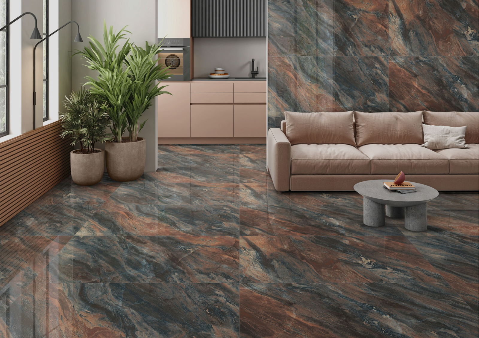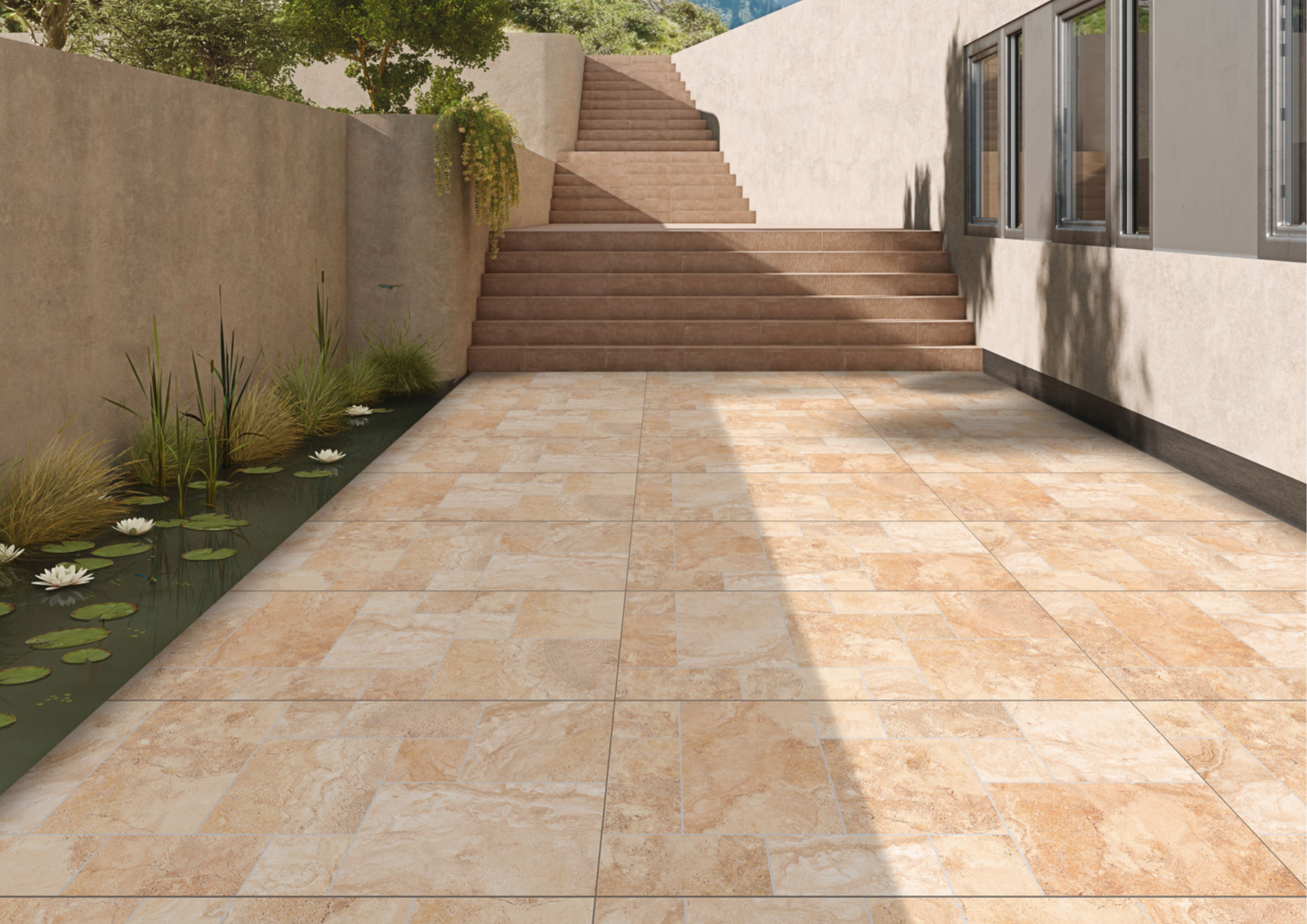



A thoughtful bedroom tiles design should do more than match the furniture. Bedrooms are spaces where material scale, warmth, lighting and visual movement need to feel controlled. The floor often forms the largest continuous surface, while selected walls can introduce texture, colour or a stronger architectural identity.
For architects and interior designers, the objective is to create a bedroom that feels composed and calm without becoming visually ordinary.
Start with the atmosphere the bedroom needs
Before selecting a tile, decide whether the room should feel warm, minimal, earthy, luxurious, colourful or highly architectural. This gives every later decision a purpose: colour, finish, texture and layout can all support the same atmosphere.
1. Wood-inspired tiles for a warmer bedroom
Wood-inspired surfaces can soften the visual character of a bedroom through grain, tonal variation and natural material references. Capron TRACE explores this direction in 600×1200 mm surfaces, offering an alternative material language for floors and selected walls.
The grain direction should be considered together with the room geometry, bed placement and circulation rather than treated as an installation afterthought.

2. Keep the bedroom floor visually calm
Bedrooms usually contain several layers of textiles, furniture and storage. A floor with controlled movement can give those elements a stable base. This does not mean the floor must be plain; subtle stone movement, wood grain or restrained tonal variation can provide character without becoming dominant.

3. Use 600×1200 tiles to create broader material planes
A 600×1200 mm format can reduce joint frequency and create a more continuous visual field when it suits the room proportions. Before installation, map the grid against wardrobes, doors, the bed axis and adjoining passages.
The strongest layout is usually the one that aligns with the architecture rather than simply beginning from the easiest installation point.
4. Create a feature wall behind the bed
The wall behind the bed naturally acts as a focal plane. Instead of depending only on paint or decorative panels, a tile surface can introduce colour, texture or relief directly into the architecture.
Prism can support colour-led feature walls, while AIR, AIR Plus and AIR Pro offer different texture and decorative directions. The remaining walls can stay quieter so the focal surface retains hierarchy.

5. Use colour without making the bedroom visually busy
Colour works best when its proportion is controlled. Muted blue, green, cocoa, ash and earthy tones can establish atmosphere without requiring every wall to carry the same colour.
Capron Prism provides a broader palette including Ash, Blue, Brick, Mint, Emerald, Green, Dusk Blue and Cocoa, giving designers options beyond conventional beige and grey.
6. Coordinate tiles with wardrobes and furniture
Bedroom tile samples should be reviewed beside wardrobe laminates or veneers, upholstery, bed finishes, metal details and paint. A tile that looks neutral in isolation may read warmer or cooler once it sits beside timber or fabric.
This coordination is especially important in compact bedrooms where the floor, wardrobe and bed are visible together from almost every angle.
7. Think about lighting before choosing the finish
Bedrooms often use softer, warmer artificial lighting than kitchens or workspaces. That lighting can change the apparent colour and texture of a tile. Grazing light can reveal relief on a feature wall, while glossy surfaces can create stronger reflections from bedside lamps and windows.
Review the finish according to the lighting concept rather than treating gloss or matt as a purely stylistic choice.
8. Can glossy tiles work in bedrooms?
They can be considered where a polished and reflective character supports the design. Gloss may increase visual activity because it reflects furniture, windows and lighting, so it should be used intentionally.
PGVT and other glossy Capron directions can create this type of expression in suitable applications.

9. Use darker surfaces as an anchor
Dark bedroom tiles do not have to cover every surface. A darker floor, headboard wall or selected architectural plane can anchor a lighter palette. Zed Black and darker Karbon directions can be explored where the concept calls for stronger depth and contrast.
Balance becomes important: pale walls, warm timber, textiles and controlled lighting can prevent the composition from becoming visually heavy.
10. Connect the bedroom to the rest of the home
A bedroom can have its own atmosphere while still belonging to the larger material story. Maintain a connection through format, undertone, grout, or a recurring material family used elsewhere in the residence.
This is often more sophisticated than repeating exactly the same tile in every room.
Bedroom tile planning by design goal
| Design goal | Surface direction | What to consider |
|---|---|---|
| Warm and natural | Wood-inspired | Grain direction, timber furniture and warm lighting |
| Calm and minimal | Soft neutral / restrained stone | Low visual movement and tonal continuity |
| Colour-led | Prism-inspired palette | Use one leading colour and quieter supporting materials |
| Textural | AIR / AIR Plus / AIR Pro direction | Position lighting to reveal surface depth |
| Polished | Gloss / PGVT direction | Control reflections and surrounding visual activity |
Bedroom tile specification checklist
- Define the desired bedroom atmosphere first.
- Coordinate the floor with wardrobes, upholstery and furniture.
- Plan 600×1200 joints around the actual room geometry.
- Use feature walls selectively.
- Review colour and finish under planned bedroom lighting.
- Coordinate grout with the desired visual continuity.
- Check physical samples rather than relying only on screen images.
- Confirm the exact product’s suitability for its intended application.
Common bedroom tile mistakes
Choosing the floor before the rest of the palette
The floor occupies a large visual area. Review it together with wardrobes, paint, furniture and textiles.
Making every wall a feature wall
Visual hierarchy disappears when every surface demands attention. Choose one or two architectural moments to emphasise.
Ignoring warm artificial lighting
A tile selected in bright showroom light can read differently under bedside and ambient lighting.
Using large-format tiles without layout planning
The format alone does not guarantee a clean result. Joint placement and cuts need to be resolved before installation.
Frequently asked questions
Which tiles are best for a bedroom?
There is no single best choice. Select according to the desired atmosphere, room proportions, lighting, furniture palette and the exact product’s intended application.
Are wood-look tiles suitable for bedrooms?
Wood-inspired tiles can be an effective design direction when the project needs warmth and grain. Their colour and grain should be coordinated with the rest of the room.
Which tile colour is good for bedrooms?
Soft neutrals, wood tones, muted greens, blues, earthy shades and darker accents can all work. The appropriate colour depends on lighting and the complete material palette.
Can tiles be used on a bedroom feature wall?
Yes, subject to the chosen product’s intended application. Colour, texture and relief can turn the wall behind the bed into an architectural focal plane.
A bedroom should feel designed, not decorated surface by surface
The strongest bedroom tile schemes coordinate floor, wall, furniture, lighting and textiles as one composition. The result can be quiet or expressive, but every surface should have a reason for being there.
Capron TRACE, Prism, Nova and complementary Evolution Surfaces give designers multiple routes into bedrooms that feel warmer, more layered and more architectural.
Explore Capron Evolution Surfaces for bedroom interiors built around material, light and atmosphere.